
Our evaluation of the form on the CICan website revealed critical usability and accessibility issues, including unclear organization, poor visual hierarchy of privacy information, misalignment with user mental models, a lack of inclusive design, and a failure to follow aesthetic and minimalist design principles.
Our evaluation also revealed critical design gaps on the homepage, including a lack of contrast in color usage, absence of a navigation bar and footer section, use of non-inclusive imagery, and buttons embedded within images rather than clearly labeled elements. These issues contributed to poor accessibility and user orientation.

Develop
This phase focused on transforming our research insights into meaningful design improvements.
%201.png)
Old
design
On Day 2, we spent 6 hours redesigning the tool based on our findings. We reviewed the original design, identified usability challenges, and implemented targeted changes to enhance the overall experience.
Research Findings
Discover
The website aims to support learners through accessible digital learning tools. In this phase, we explored the challenge by gathering insights, analyzing existing issues, and understanding user needs.

How Might We (HMW)
We started by exploring prompt questions and identifying key challenges. We chose the following question: How might we improve the usability and ensure equitable access to the tool for learners with diverse digital skills and accessibility needs?

Heuristic Evaluation
To better understand the problem, we conducted a five-hour heuristic evaluation of the tool based on Jakob Nielsen’s 10 usability heuristics.

Creating Personas
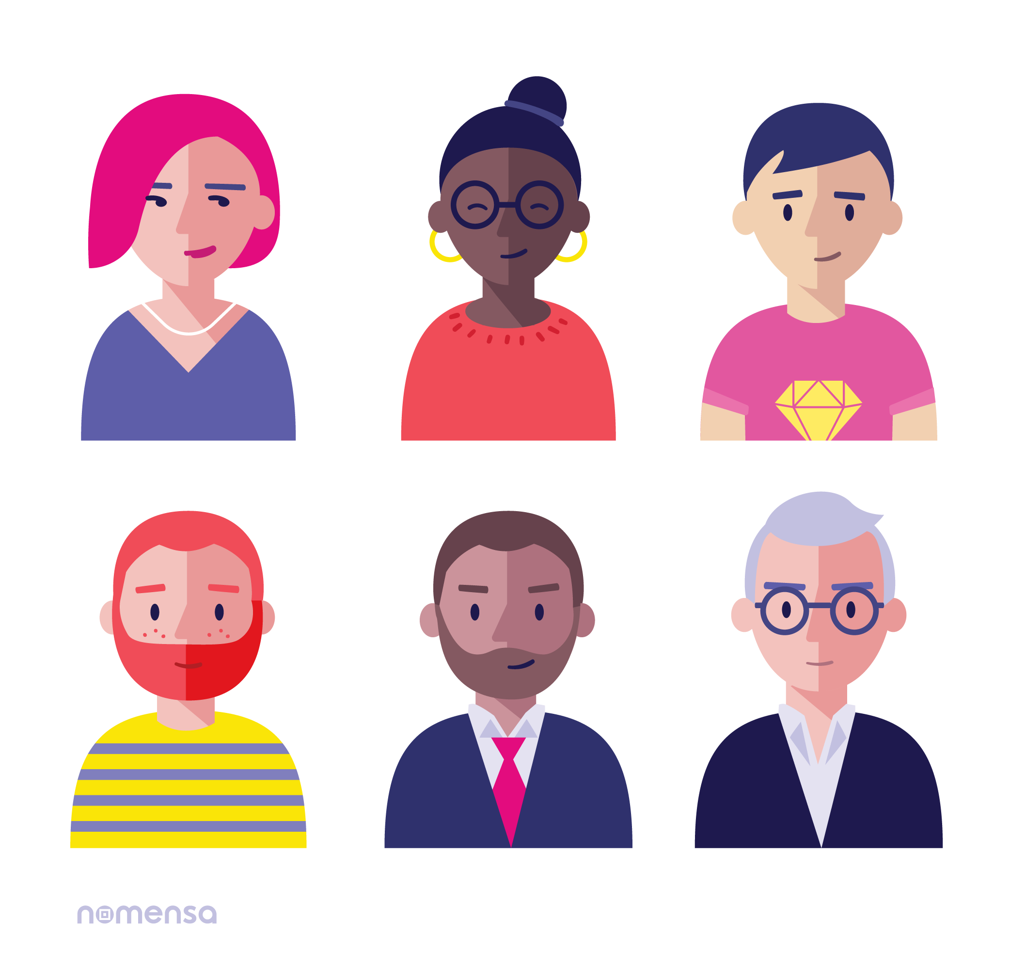
My team and I created four personas representing users with different backgrounds and digital literacy levels to ensure inclusivity in our solutions.

Conclusion
Winning this national hackathon, competing against colleges across Canada, was a rewarding and empowering experience. It validated our design approach and emphasized the power of collaboration under tight deadlines. As a UX designer, I learned to quickly align with a multidisciplinary team, divide tasks effectively, and make informed decisions to deliver a user-centered solution within two days. This experience strengthened my ability to apply research insights rapidly and design with accessibility and inclusivity at the forefront.
Design Thinking Process
This hackathon project aims to enhance the usability and accessibility of a digital tool, ensuring it meets the diverse needs of learners with varying digital skills and accessibility requirements through a human-centered approach.
Key Insights Analysis
Optimized visual design for a cleaner, more intuitive experience.
Improved graphs and data visualization for better comprehension.
Increased color contrast to enhance readability.
Refined layout to support intuitive navigation.
Robust filtering options to improve content accessibility.
Complete re-engineering of critical sections to ensure universal usability.
Improved iconography for clarity and recognition.
Enhanced screen reader compatibility for better accessibility.
Contextualized usability tailored to specific user tasks.
Reduced cognitive load through simplified design and clearer information hierarchy.
Define
In this phase, we synthesized our research findings to define the core problems that needed to be addressed clearly. By referring back to the four personas we created, each representing different backgrounds, digital skill levels, and accessibility needs, we ensured our insights were grounded in real user perspectives.
User Persona

Design Improvements
Navigation Bar: We added a clear, top-positioned navigation bar for easier tabbing between sections.
Inclusive Imagery: We selected diverse, inclusive images to represent all users better.
Contrast Improvement: We adjusted color contrasts to meet WCAG accessibility guidelines.
Explore Skills Section: We reframed the Privacy Statement as a banner for better visibility and applied progressive disclosure using clearly labeled tabs to reduce cognitive load.
My Career Path Section: We renamed this section for clarity and personalization, and integrated an AI-powered conversational interface that helps users articulate goals and transitions.
%20home%20page%201.png)
Design Improvements
Iconography Adjustments: We enlarged and repositioned icons for improved visibility, marking them as decorative to optimize screen reader usability.
Partner Section: We harmonized the visual style with the rest of the page.
Footer Addition: We included a footer with essential site information to align with standard web practices.
%20home%20page%202.png)
Deliver
This phase focused on transforming our research insights into meaningful design improvements.

CICan Navigator
Education Tool - Hackathon Project Winners
22-23 March 2025

.png)
Project Timeline
